MATLAB Plots - Learning the Basics
Plots and graphs are perhaps the most convenient way to present engineering information and scientific data. Since MATLAB includes a number of different options for creating two-dimensional plots, I have decided to split the explanation over three posts. In this first post I will introduce the basic tools for creating MATLAB plots. In the second post I will discuss how to format the appearance of your plots, and in the final post we will see how to make multiple plots on the same set of axes or on different axes within the same figure.
Plot and Figure Functions
Basic plotting in MATLAB is done using the built-in plot() function. I'd like to introduce this simply by example using the table of voltage and current data given below.
| Current (mA) | Voltage (V) |
|---|---|
| 0.0 | 5.0 |
| 1.0 | 10.0 |
| 5.0 | 15.0 |
| 10.0 | 20.0 |
| 20.0 | 25.0 |
The following MATLAB code will create a two-dimensional plot of voltage versus current using the
plot() function. Note that I first create vectors corresponding to the current and voltage data and use them as input to plot().
% Create the vectors of data current = [0 1 5 10 20]; voltage = [5 10 15 20 25]; % Create plot inside new figure with plot() function figure plot(current,voltage) |
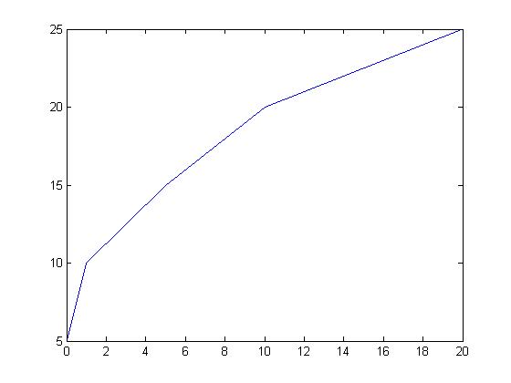
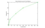
The plot function simply uses a series of data points given by vectors of their values on the horizontal and vertical axes, plots the series of points, and connects them with straight lines. Using the most simple syntax, this is given as plot(xData,yData) where xData is the vector of horizontal axis values (current in the example) and yData is the vector of vertical axis values (voltage in the example). The only requirement here is that the two vectors must be the same length, which makes perfect sense as they are describing the coordinates of points in the plot!
Also, I have included an additional function prior to plot(). The figure function creates a new figure window for the plot to be drawn in. Although it is not required, I think it is good practice to include it. Below is the figure generated when we run the code.
Adding Axis Labels and Titles
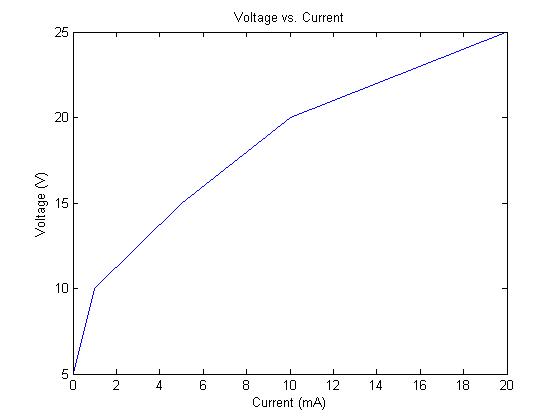
While the plot shown above gives us a good view of the data, it is not very descriptive for engineering purposes. Lets improve the code by adding commands that will add axis labels and a title to the figure.
% Create the vectors of data current = [0 1 5 10 20]; voltage = [5 10 15 20 25]; % Create plot in new figure with axis labels and title figure plot(current,voltage) title('Voltage vs. Current') xlabel('Current (mA)') ylabel('Voltage (V)') |
Note that the tabs/indentation in the code above are not required, but I have included them to organize the code. The title() function adds text above the figure while xlabel() and ylabel() add text to the horizontal and vertical axes, respectively. These functions each take string input. A string in MATLAB contains characters rather than numerical values and we specify strings by enclosing them in single quotations (for example, 'this is a string').
Plotting an Equation - Example
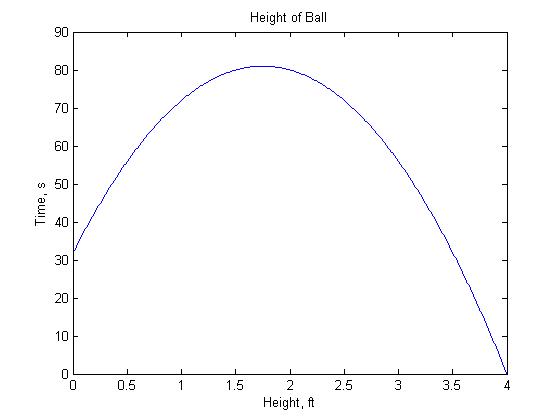
Plotting functions or equations in MATLAB can be done in the same way as plotting vectors of raw data. Remember that all we need to use plot() are two equal length vectors of data. For example, lets make a plot for the height (in feet) of a ball thrown in the air that is described by the function  from zero to 4 seconds.
First we create a vector of time values and evaluate the height at each time using element-by-element math. We then use this to create a plot (while adding some nice axis labels and a title).
% Create vector of time values t = [0:0.01:4]; % Evaluate height at each time (element-by-element) h_t = -16.*t.^2+56.*t+32; % Create plot in new figure with title and axis labels figure plot(t,h_t) title('Height of Ball') xlabel('Height, ft') ylabel('Time, s') |
Fplot Function
Function plotting can also be accomplished using the MATLAB fplot() function. This function can plot equations of a single variable using a few less lines than the previous method. To use fplot you must specify the equation to be plotted as a string (without using element-by-element notation) along with a vector of containing the lower and upper limits for the horizontal axis.
The following code will produce a plot nearly identical to the one above.
% Create plot in new figure using fplot() with title and axis labels figure fplot('-16*t^2+56*t+32',[0 4]) title('Height of Ball') xlabel('Height, ft') ylabel('Time, s') |
Now that we can make basic plots in MATLAB, lets look at the next post. There I will cover formatting the color and style of plot lines: Formatting MATLAB Plots.

